


How to Use the Psychology of Color in Your Branding
Colors play a crucial role in influencing your customers’ perception of your brand.
Whether you’re a fashion retail store widening your customer reach, a realtor handing out promotional products to new prospects, or a software-as-a-service (SaaS) company that’s looking to establish client trust, you can leverage a color’s emotive meaning to solidify your brand personality and connect with your target audience.
In this guide, we’ll cover some of the fundamentals of color psychology to help you select a color palette that represents the brand image you want your customers to form about your company. You'll learn why color matters in marketing and gain practical tips on choosing a color palette that wins attention in the marketplace and connects with your customers.
What is Color Psychology?
Color psychology is the theory and study of colors and their impact on people’s perceptions, moods, and behavior.
How do colors affect us? Some colors have universal meanings, while others may be open to cultural interpretation so our experiences of color can be subjective. However, certain color families tend to evoke similar responses. For example, warm colors such as red, yellow, and orange are energizing and can stimulate strong emotions, including positive ones like feelings of comfort and negative ones like anger. By contrast, the cool colors -- green, blue, and purple -- can generate varied emotions, from calmness to sadness.
Why is Color Psychology Important in Branding?
Customers select products that resonate with their personalities and temperaments. In branding and marketing, color psychology focuses on how it influences customers’ impressions of brands and whether or not they convince buyers to buy a product, patronize the business, take their offers, or perform the company’s desired actions.
By effectively using colors in branding, you express key attributes about your brand and product that attract the right people. However, if you choose colors without being mindful of the perception it imparts, a misalignment will brew in your customers’ minds about how to perceive your company, which then makes your brand image less sticky.
How to Determine Which Colors Work Best for Your Brand?
Be mindful of the colors you'll apply to your brand. Follow these four steps to help you select the best colors for your organization’s branding.
1. Know Color Meanings
Learn the personality attributes people typically associate with colors. In that way, the colors you choose align directly with your business goals and the brand perception you want your target audience to have about your company.
For instance, red is perceived as a powerful color, evoking action, fearlessness, energy, and strength. It also signifies romance and passion. Orange is reminiscent of the warmth of a hot summer day, conveying friendliness, energy, and confidence.
Being the color of sunshine, yellow conjures feelings of happiness, extraversion, and creativity. On the other hand, green embodies prosperity, health, freshness, hope, growth, and nature. Blue typifies reliability, loyalty, trust, security, logic, and serenity.
When people see black, they remember elegance, sophistication, substance, power, authority, and security. White personifies purity, clarity, cleanness, freshness, simplicity, and sophistication; while gold represents traditions, value, wealth, wisdom, and prosperity.
Now that you have a glimpse of the emotions or perceptions specific colors impart, you're in a better position to choose colors that align with the personality and image you want to portray in the marketplace.
2. Define your brand personality
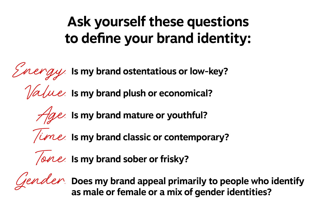
Your answers here help you determine what makes your brand distinct and how to connect with your target audiences.
3. Understand Industry Colors
Colors can evoke different impressions on consumers depending on the industry.
For example, red can stimulate hunger, making it popular in the restaurant industry, including well-known brands like McDonald's, Wendy's and Burger King. However, red also signifies passion, so H&M, Puma, Macy's and other fashion brands use it to depict its attractive, energizing products.
Green frequently depicts health, wellness, and eco-friendliness, making it popular among restaurants (e.g., Subway), pharmaceuticals, and specialized chemicals. But it also represents wealth and prestige, so Grab, Shopify, Starbucks and other brands leverage it to promise business growth and make people feel a sense of belongingness and exclusivity.
Put these insights to work for your company by looking at industry-leading companies with distinctive brands in your space. For example, you can study, emulate, and build upon the color schemes used by household-name companies like HP, Netflix, Spotify, Barbie, Netflix, Nikon and others.
Notice that these brands usually exhibit one dominant brand color along with a few complementary shades. Complimentary shades can be incorporated into your advertising collateral or custom logo products. For example, Spotify’s primary color is green with white and black as grounding neutrals. Netflix chiefly uses red, also supplemented with black and white.
Without question, these color schemes produce a distinct, memorable, and impactful effect on people who see their logos and promotional products.
4. Stay trendy, but remain true to yourself
Different color trends emerge every year, with Pantone’s Color of the Year releases as one prominent example. While it can be tempting to adopt a new on-trend color palette, shifting colors too often can dilute the meaning and impression you aim to convey with colors.
It’s critical to keep your core brand colors to build a clear identity in the marketplace. If you want to incorporate of-the-moment colors, you can use them as accent colors or in specific, targeted marketing campaigns. If you are utilizing promotional products to support your branding efforts, it is important to consider the color of any wearables or hand-outs used in marketing outreach. That way, you can show audiences that you're in tune with the latest trends while keeping your brand's visual identity distinctive and memorable.
Choose Brand Colors that Make an Impact
Make intelligent decisions when using color psychology in choosing your brand’s color palette. Recognize that there is more to selecting branding colors than fanciful preferences -- there is science behind it.
The impact of color psychology can very much hurt, or bolster, your branding initiatives. The key to success is ensuring your colors accurately reflect your brand personality and using your chosen colors consistently. While you can experiment with color trends and other hues, having a definitive color palette that you in all your marketing assets will help you build an attention-getting brand.
